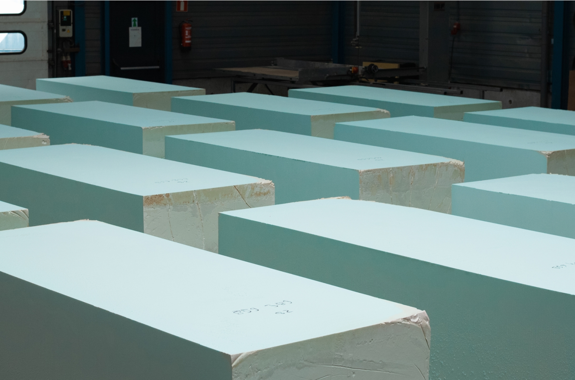
Fenolic foam, perhaps a new term for you, but when we say that this foam enables a fire-safe future, it becomes clearer right away.
Client
Teqtix - The NetherlandsExpertises
Brand strategy, visual identity, UX design, visual design, development, photography, videography, motion designTeqtix
Teqtix, once established as a consultancy firm in Phenolic Foam, has now become a leading manufacturer of high-quality thermal insulation.
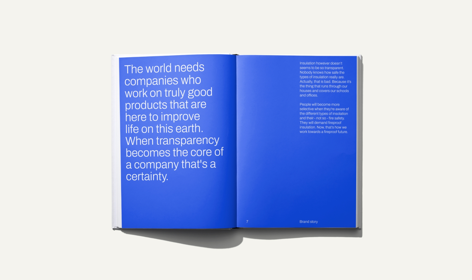
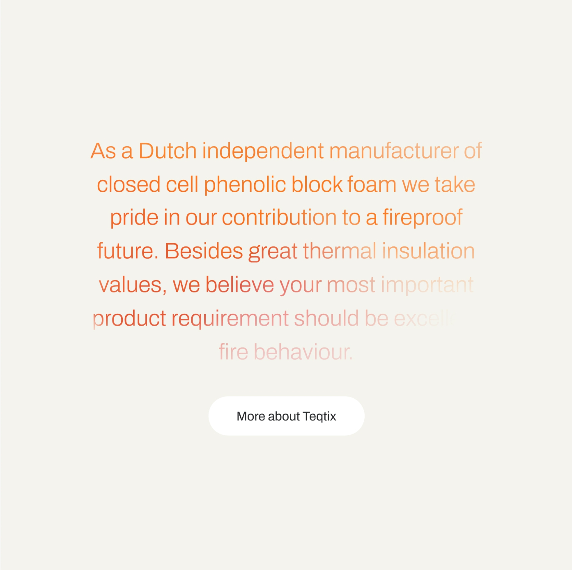
They embarked on in-house production in 2017 and achieved world-class insulation in 2020. In addition to their focus on CO2 emissions and energy efficiency, Teqtix is deeply committed to insulation safety from fire hazards. Their vision of "a fire-safe future" not only motivates themselves but also challenges their clients and the industry to excel in fire safety. When you hear Teqtix, you think of lightweight insulation, excellent fire safety, and a brighter future for everyone.
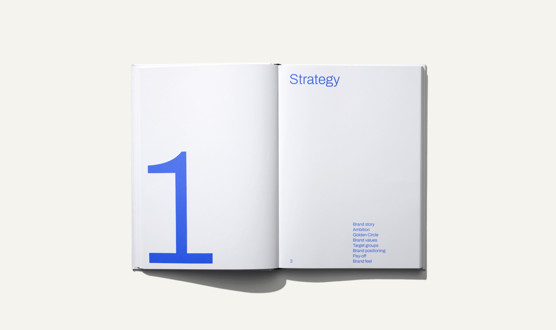
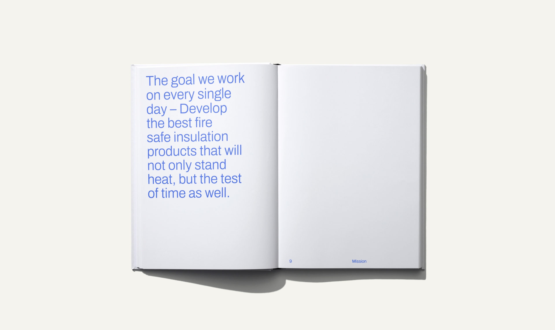
Strategic workshops have crystallized Teqtix's core values, positioning them as the producer of the world's safest insulation foam.
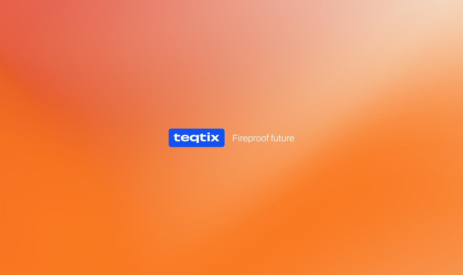
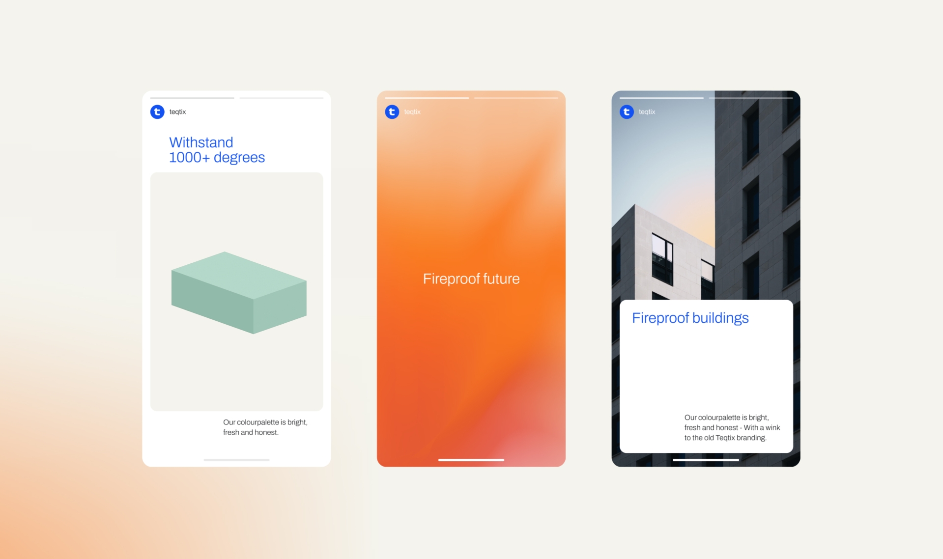
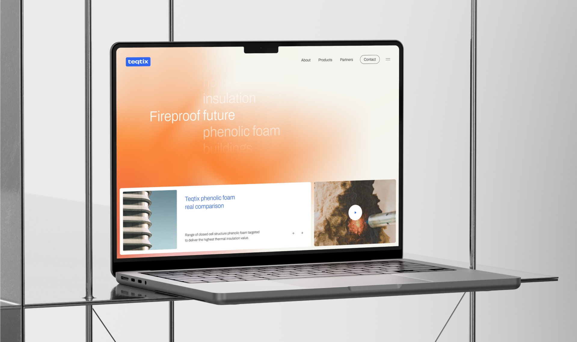
They discussed examples where unsafe insulation foam led to disastrous consequences during fires. By choosing Teqtix's insulation, valuable time is gained for safety without toxic smoke development. This gave birth to the brand concept of "fire safety," coupled with the flexible tagline, "fireproof future." Strategic models like the Golden Circle were employed to create a forward-looking brand strategy, defining personality traits like 'simple, clever, flexible, fresh, and personal,' as well as core values.
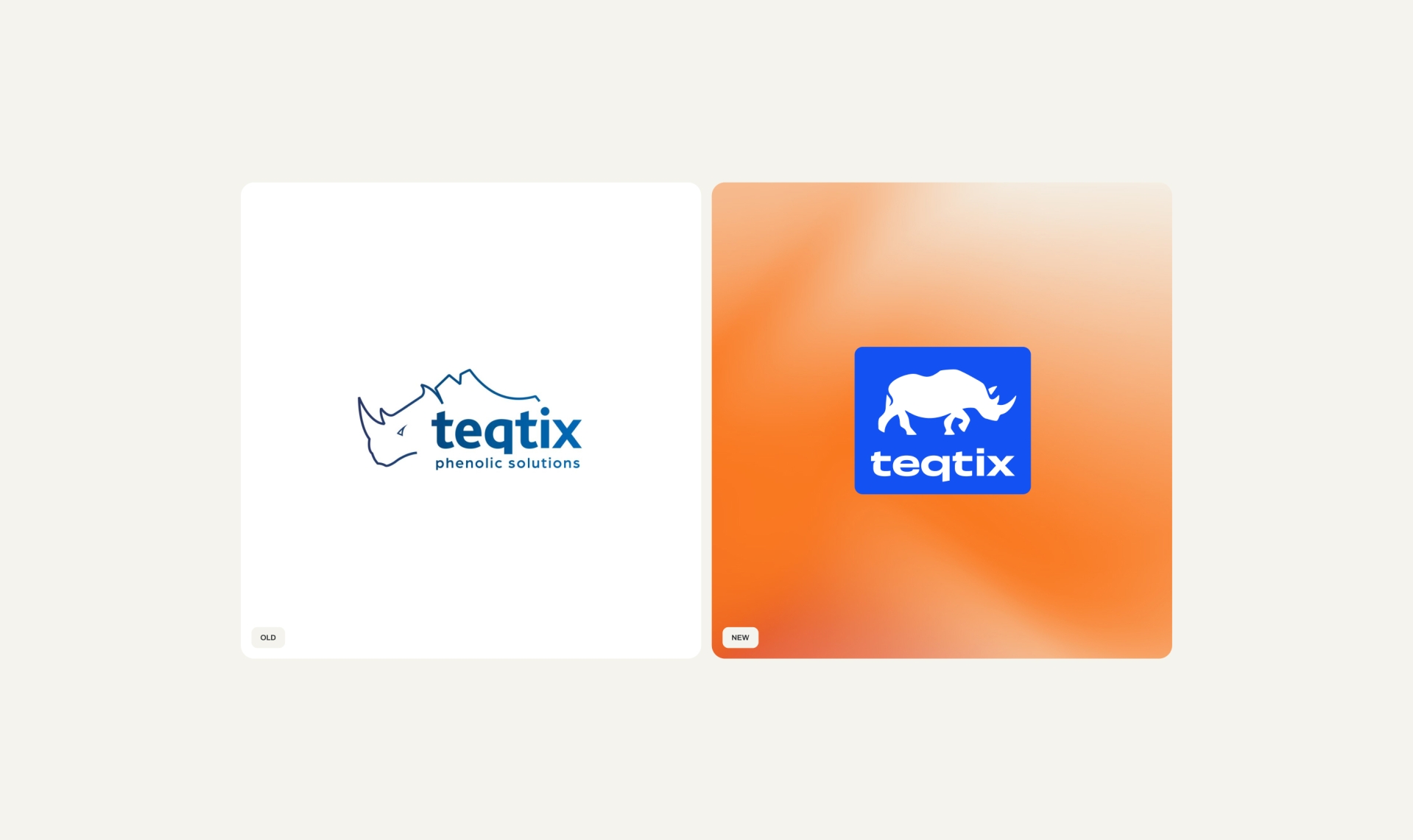
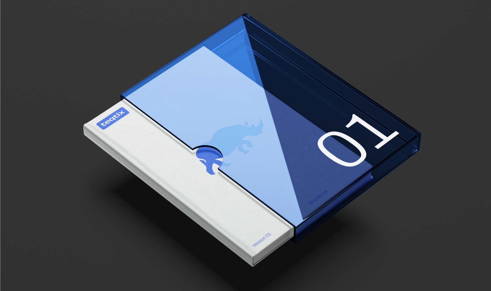
The company's director, Bert, insisted on retaining the rhinoceros as their symbol, collected during his overseas travels.
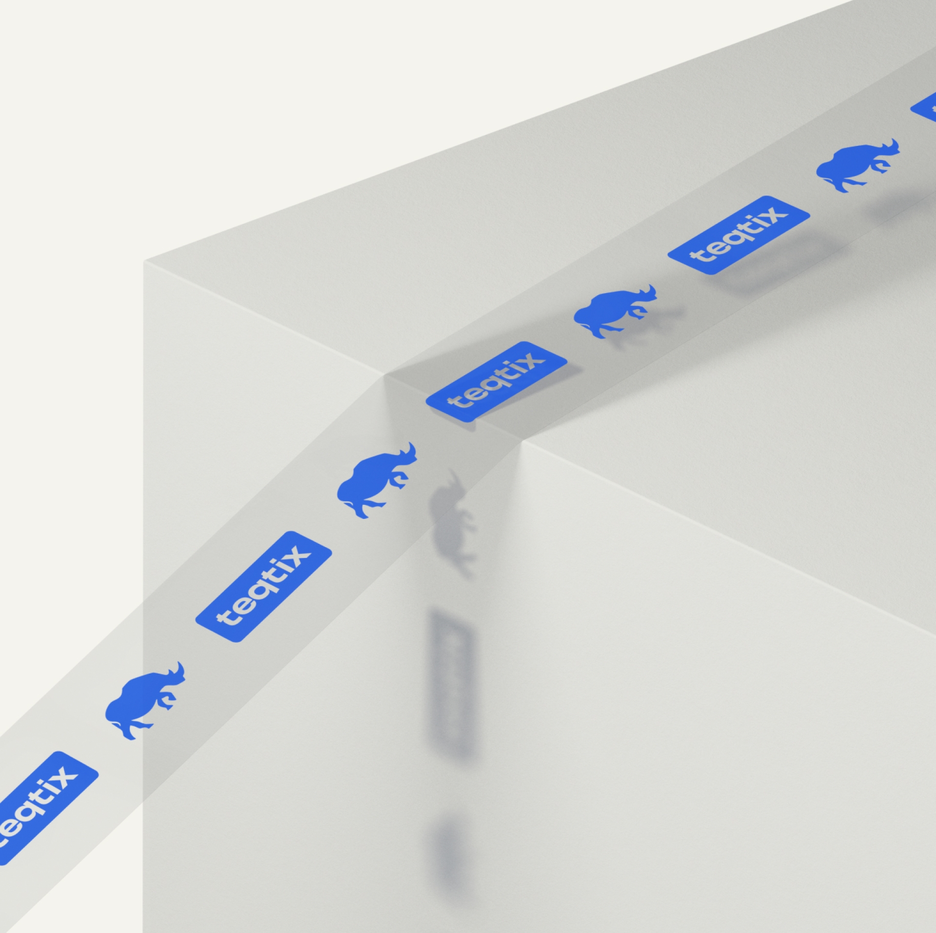
The rhinoceros logo was reimagined with a realistic representation, soft edges, and clever use of negative space. This made it friendly, memorable, and recognizable. It was combined with an abstract representation of flames (based on a burner on insulation foam) as a style element, a fresh modern blue color, and a technically oriented typography. This evolution in Teqtix's brand identity is impossible to ignore.

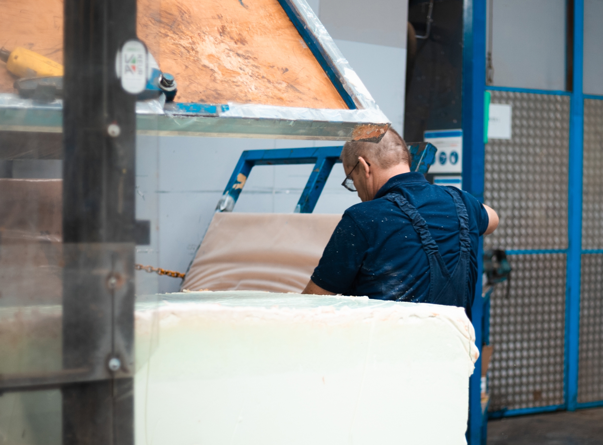
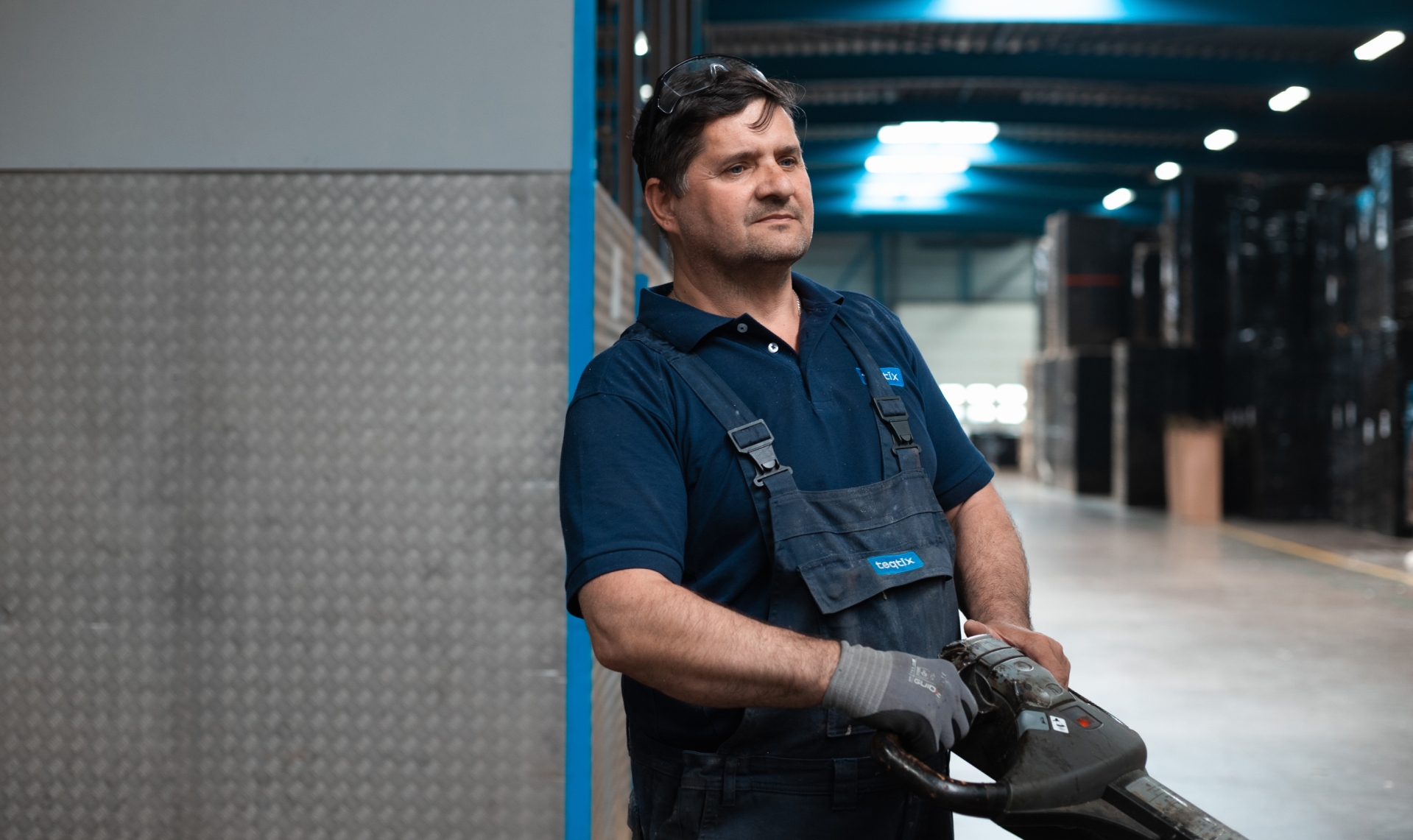
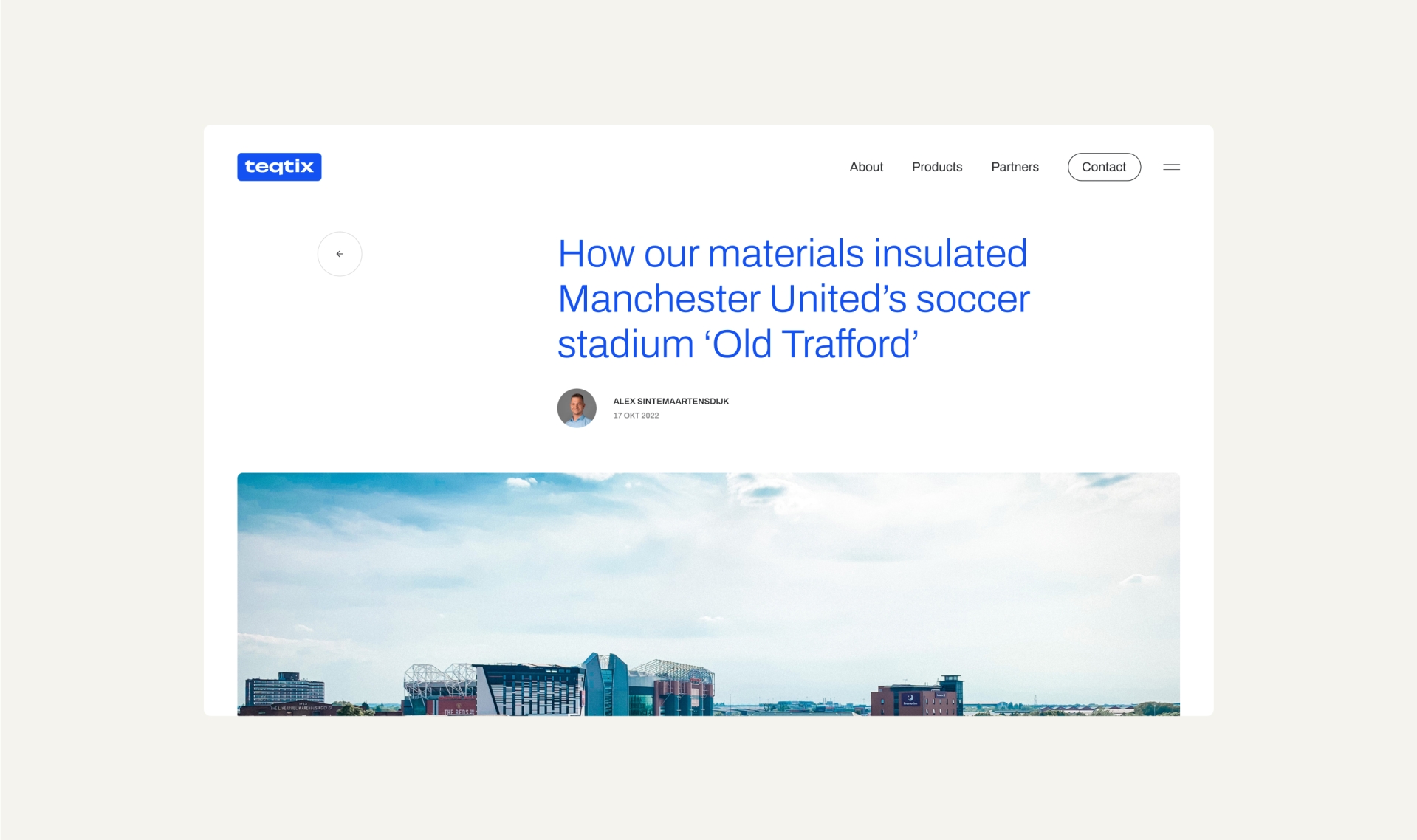
Apart from brand strategy and visual identity, we assisted Teqtix in adopting a photography style and its implementation. We also helped with recording fire tests and the execution of various communication materials.

Our web sessions with Teqtix unveiled valuable insights, including an understanding of their online audience.
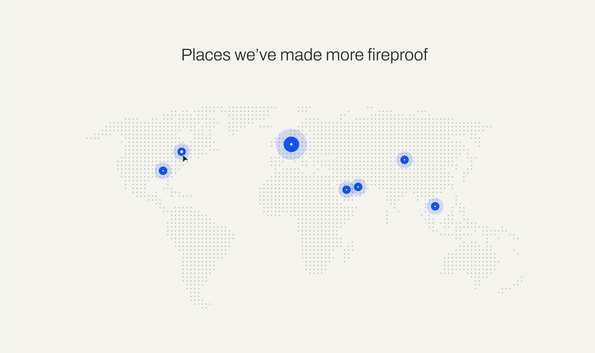
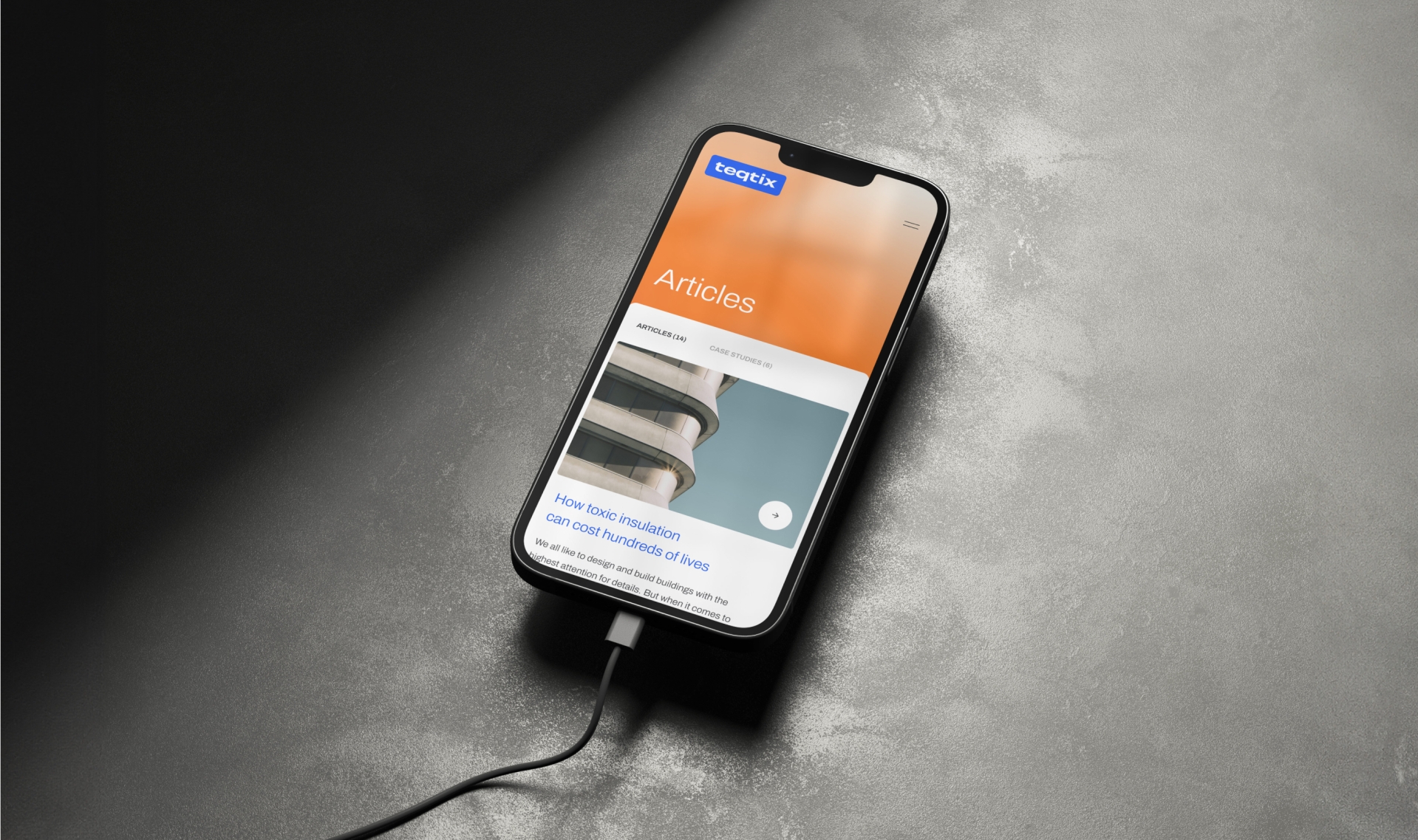
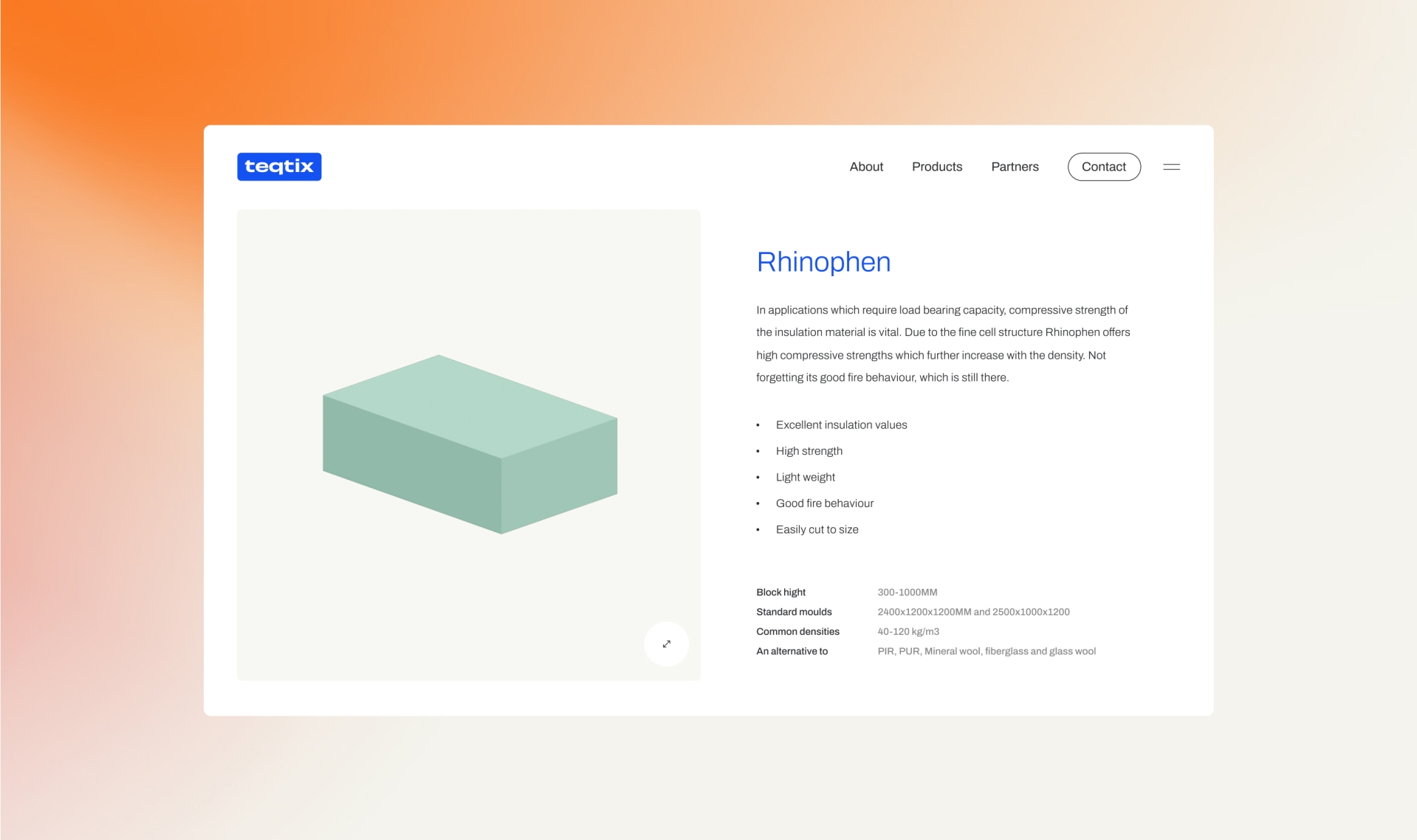
We concluded that the products alone conveyed limited information and needed to be presented in conjunction with applications. We meticulously planned and documented every aspect in wireframes. Achieving the right balance of elements, colors, and proportions in web design was a precise task. Our designers found the ideal hierarchy and balance, resulting in a striking and distinctive digital proposition. This proposition allowed room for interactive elements, such as a custom-made map and scroll animations.
Our development team, working closely with the digital design team, crafted a website that tells the story as it should be told. It guides users to where they need to go, all while exuding the brand's essence. The result is a powerful narrative that positions Teqtix as pioneers in fire-safe insulation.