While fast fashion flourishes, stores sprinkle with sales and microplastics are all over the place, we worked on a webshop that does things differently: Pehmea.
Client
Pehmea - The NetherlandsExpertises
Naming, visual identity, interaction design, visual design, copywriting, pay-off, Shopify Plus, WebflowAbout Pehmea
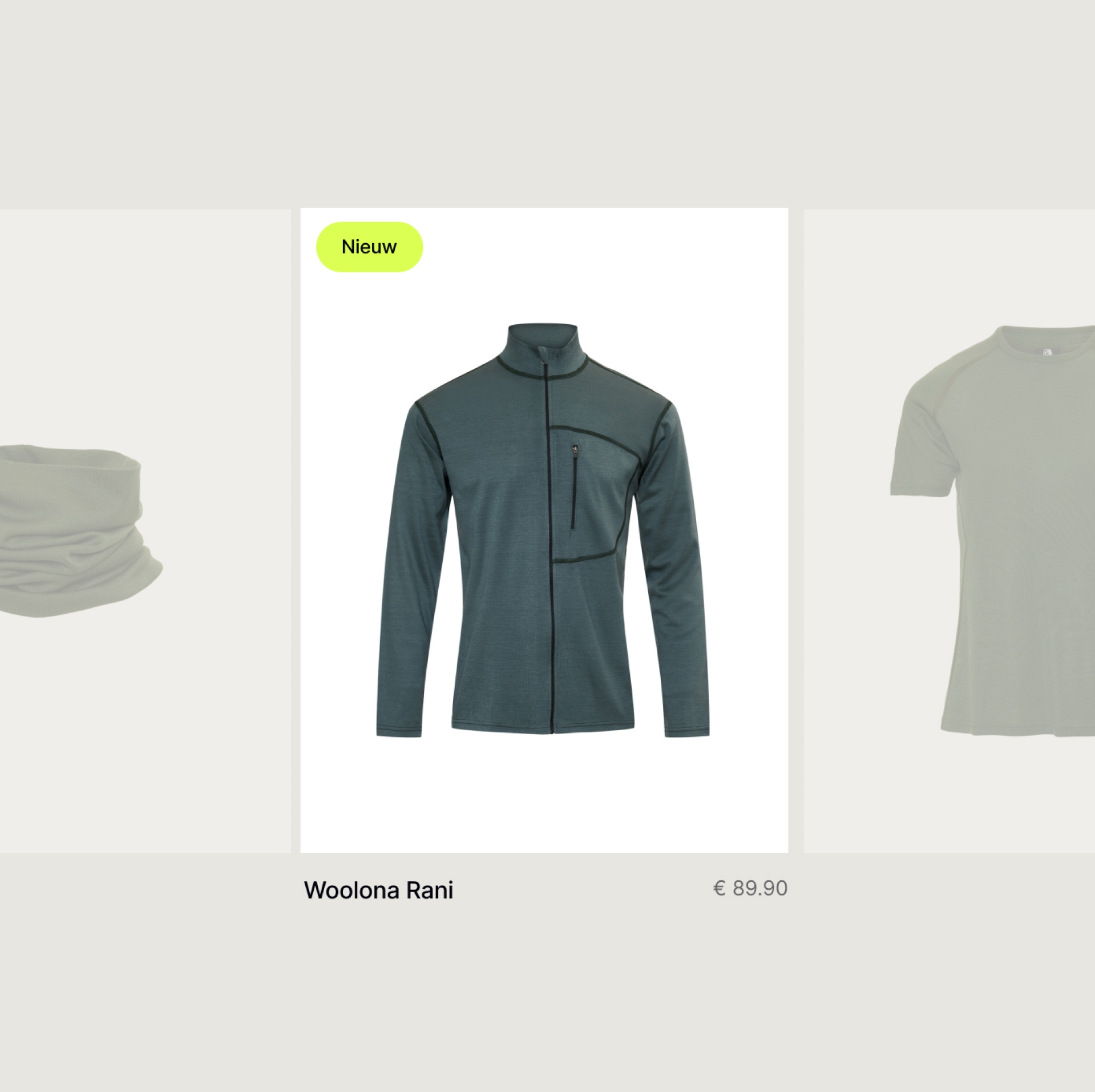
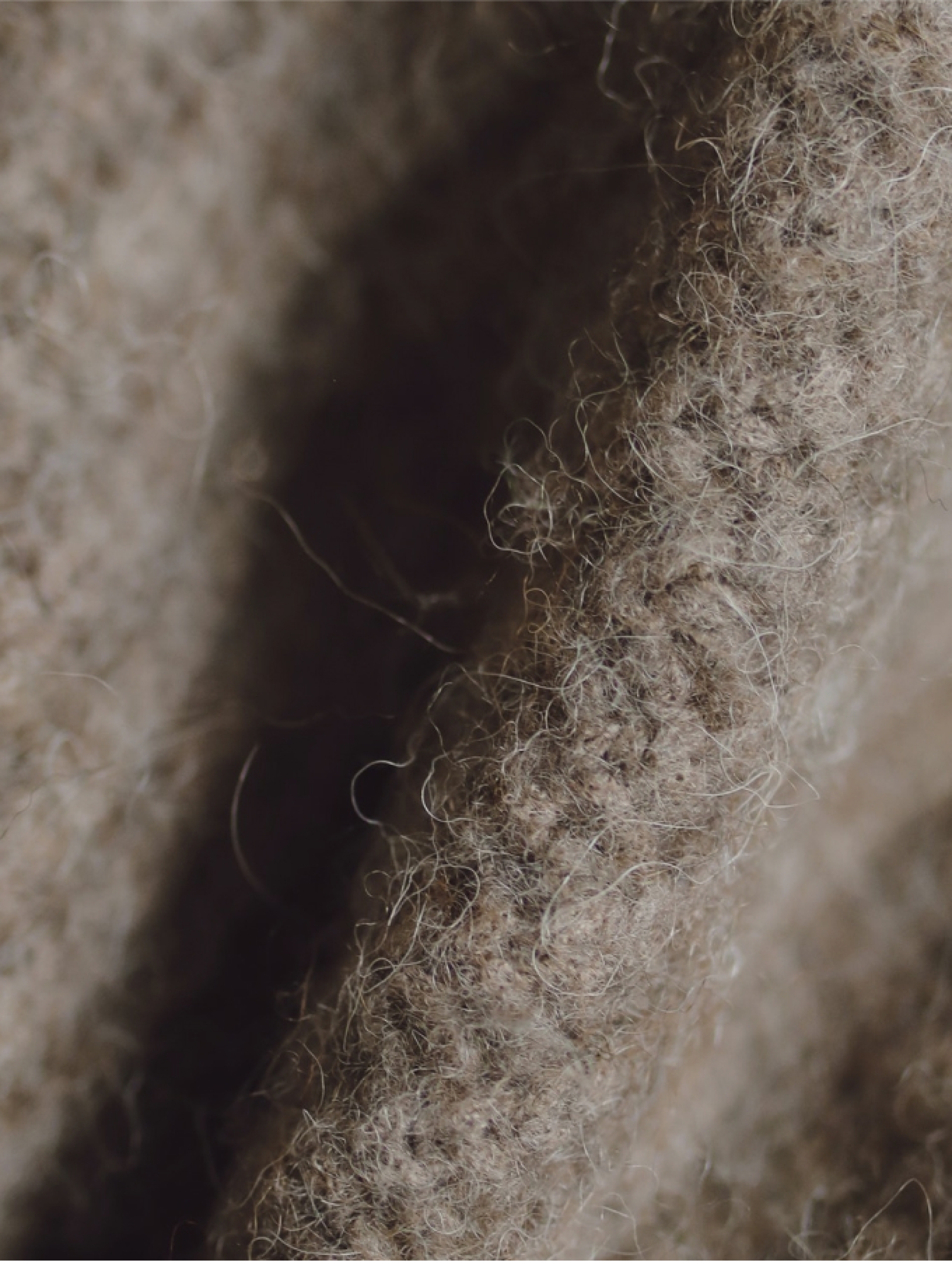
The start-up Pehmea is a clothing webshop with only 100% merino wool products. Thanks to the Woolmark label, consumers know that the clothing on their webshop is pure nature. Pehmea strives for complete transparency and also calls itself the '100% fair shop'. . Because: "At Pehmea, we tell the truth. To ourselves as well." At the start of the project, one thing became immediately clear: the merino wool products of Pehmea are wonderfully soft, but its brand message tends to go against the grain.

Coming up with a name can be quite a challenge, as there are countless options to choose from. That's why we started with the basics: defining the scope. In a two-hour session, we helped the start-up formulate a good briefin g by asking questions such as "What are we naming?" and "What are some other names that the name will be frequently seen with?". We also discussed previously explored ideas and the desired structure of the name.
From the briefing, we extracted principles for different brainstorms. For each brainstorm, we took one principle, such as "Warm Scandinavian names with an organic feel". When we presented a selection of twenty words, the client quickly became a fan of Pehmeä. That means 'soft' in Finnish.

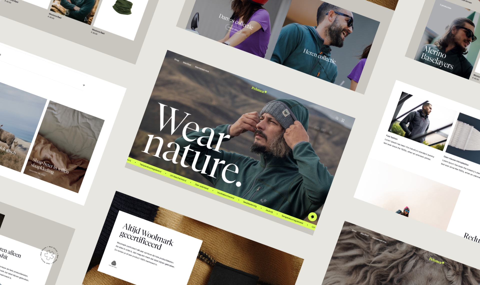
The tagline "Wear Nature" came from the presentation of the names at the beginning of the process. It is an active tagline and can also be read as "We are nature". Is it something for a future campaign?
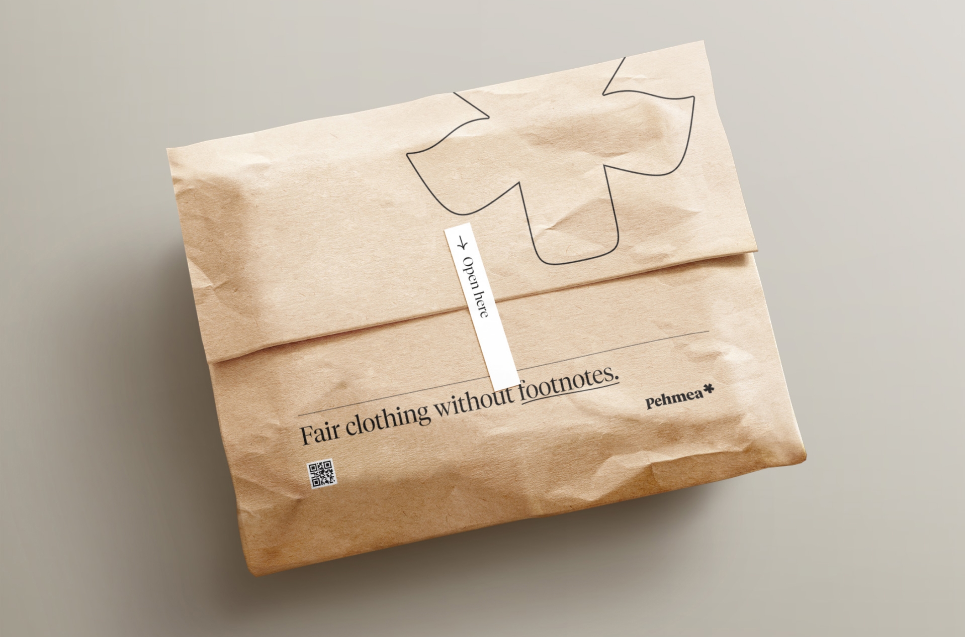
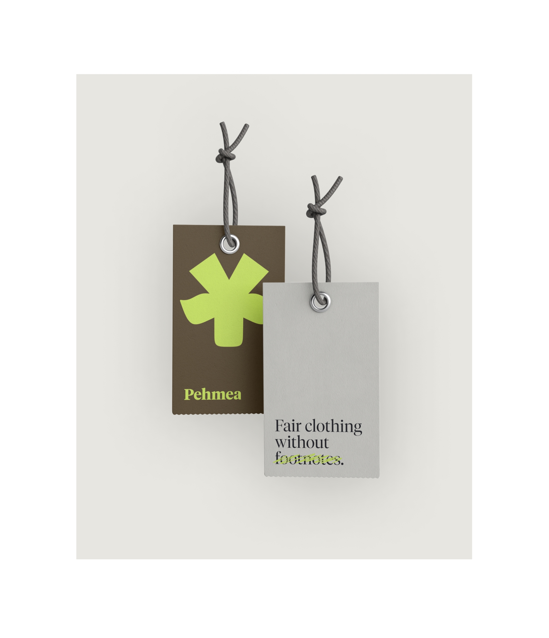
A soft, homely, and warm style would fit well with the products of the webshop, but not with the brand. This is where the value of the brand comes in. It adds value to the products. Therefore, with Pehmea, we chose to emphasize that going 100% for one thing, means going 0% for the other. The webshop is for natural products and against the unnatural habits of the fashion industry, such as clickbait claims, fast fashion, footnotes, and discounts.
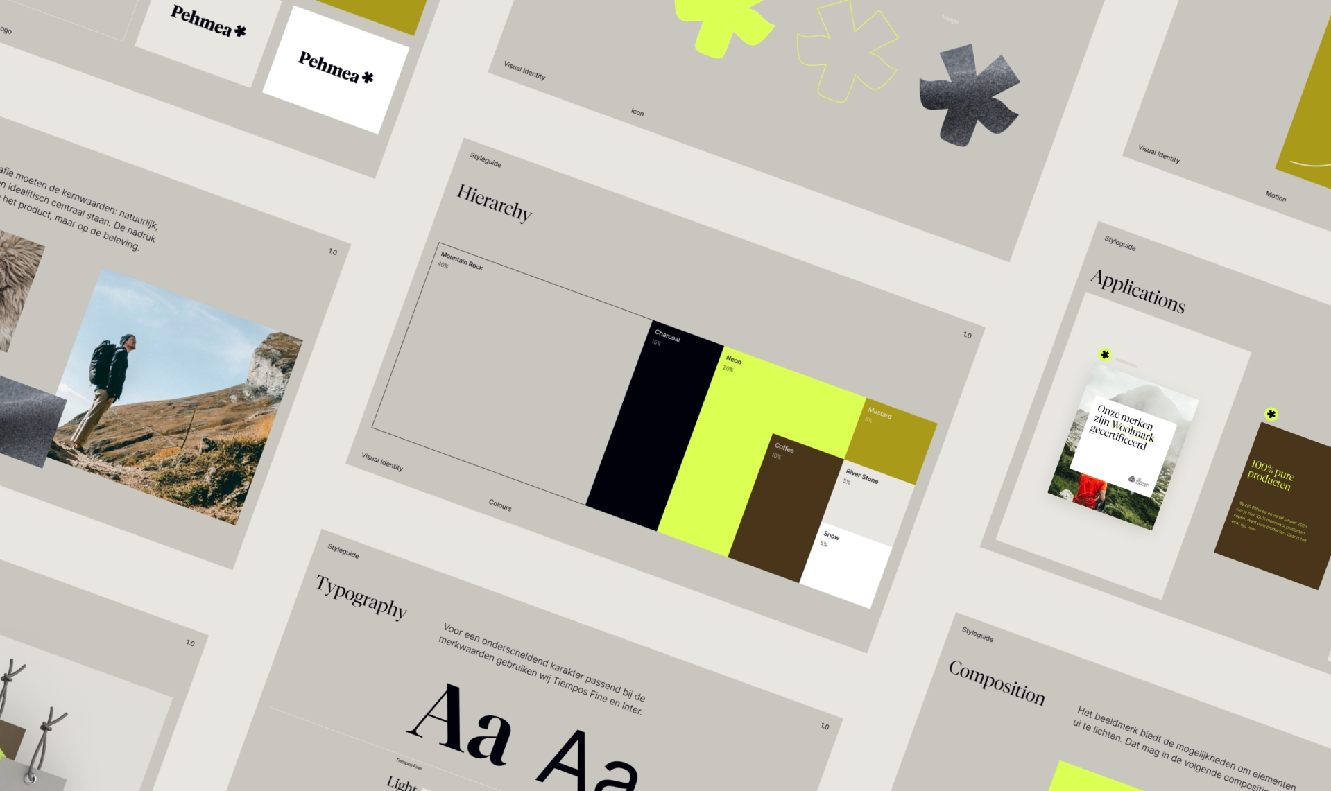
Based on the concept of "Without Footnotes," we incorporated an asterisk into the logo. By shaping the asterisk into the head of a merino sheep, we made a clever nod to the brand's message. The wordmark is inspired by Tiempos Headline and complements the logo with its balance between soft character and sharp details.
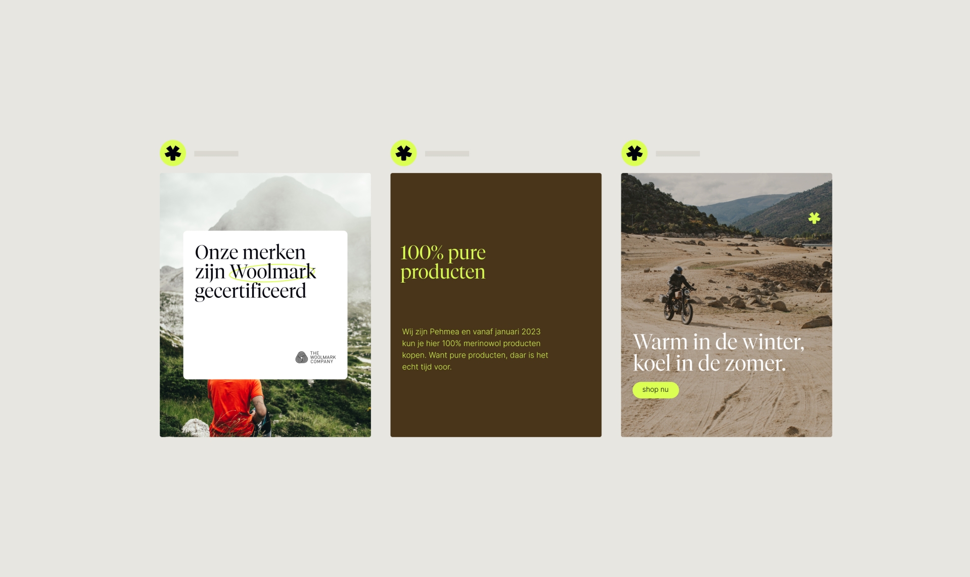
The primary neon color completes the activist character of the visual identity. The other colors bring balance and provide the necessary contrast. From the four design values "Guide," "Activist," "Everyday," and "Adventurous," we developed the concept into a complete visual identity, including typography, colors, icons, and motion.

For the launch of the webshop, we designed a 'coming soon' landing page, wrote copy that fits the brand's feeling, and developed the page in Webflow. In building the webshop, we provided support in design, copy, and construction in Shopify.